
The goal of this project for the University of Northwestern was two-fold:
- Update the main navigation of the website to better comply with WCAG 2.0 visual contrast compliancy.
- Get more people to visit the site through Google by creating a navigation system that is developed specifically for better SEO.
Key audiences: Prospective Students (Early College & PSEO, Traditional Undergraduate, Focus Adult Undergraduate, Graduate Studies, Online Programs.)
These audiences are devided into venues according to the communities they fall into. These are defined by the prospective student's age and education level. These venues are listed as: "Undergraduate", "Adult Undergraduate", "Graduate", "Online", "Early College", and "PSEO".
Our team consisted of a UX Designer (myself), a Developer, Google analyst, and a Web Director.
WCAG 2.0 Visual Contrast
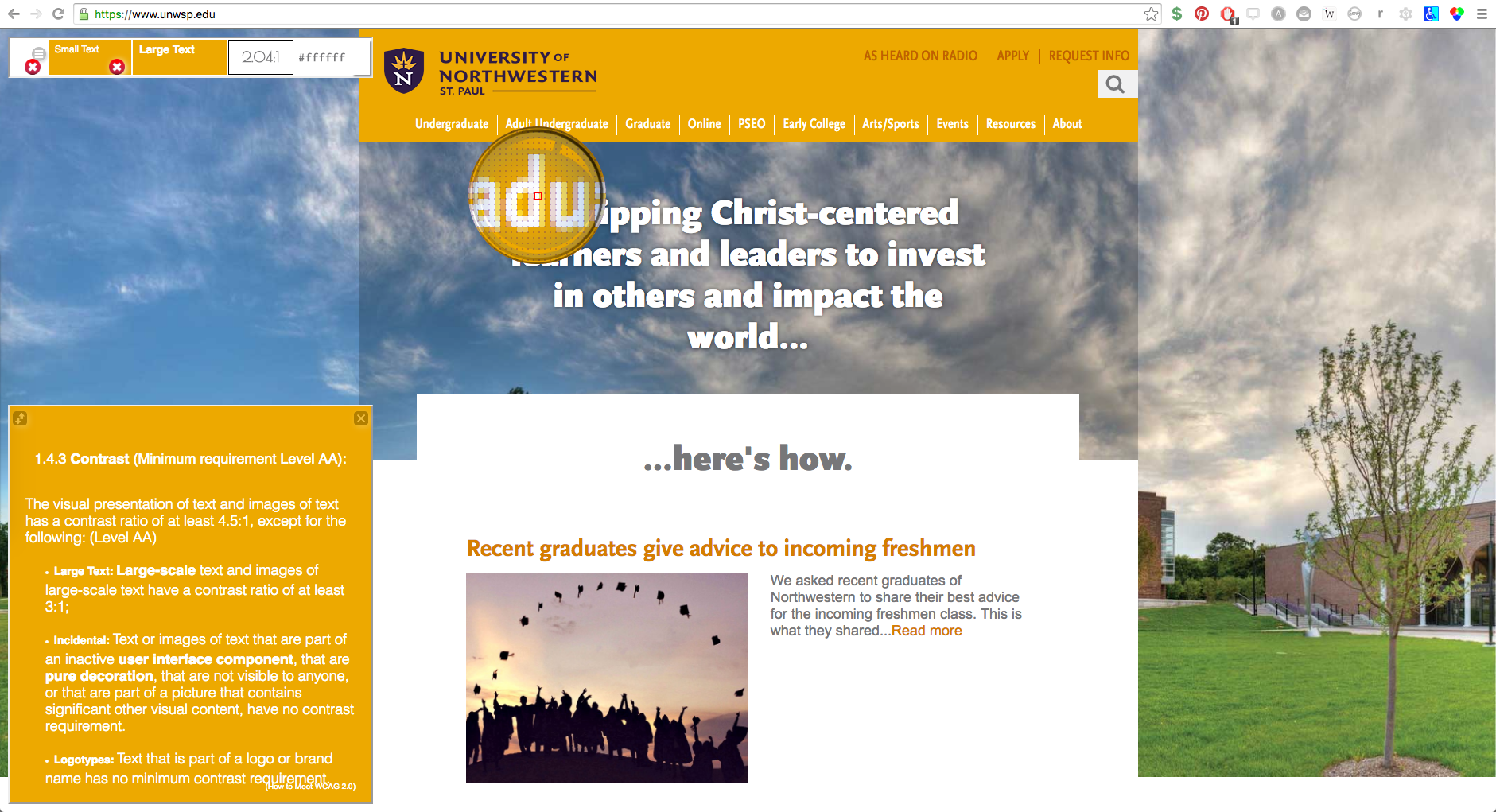
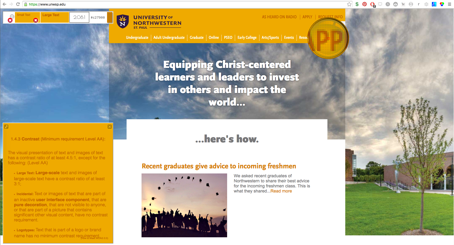
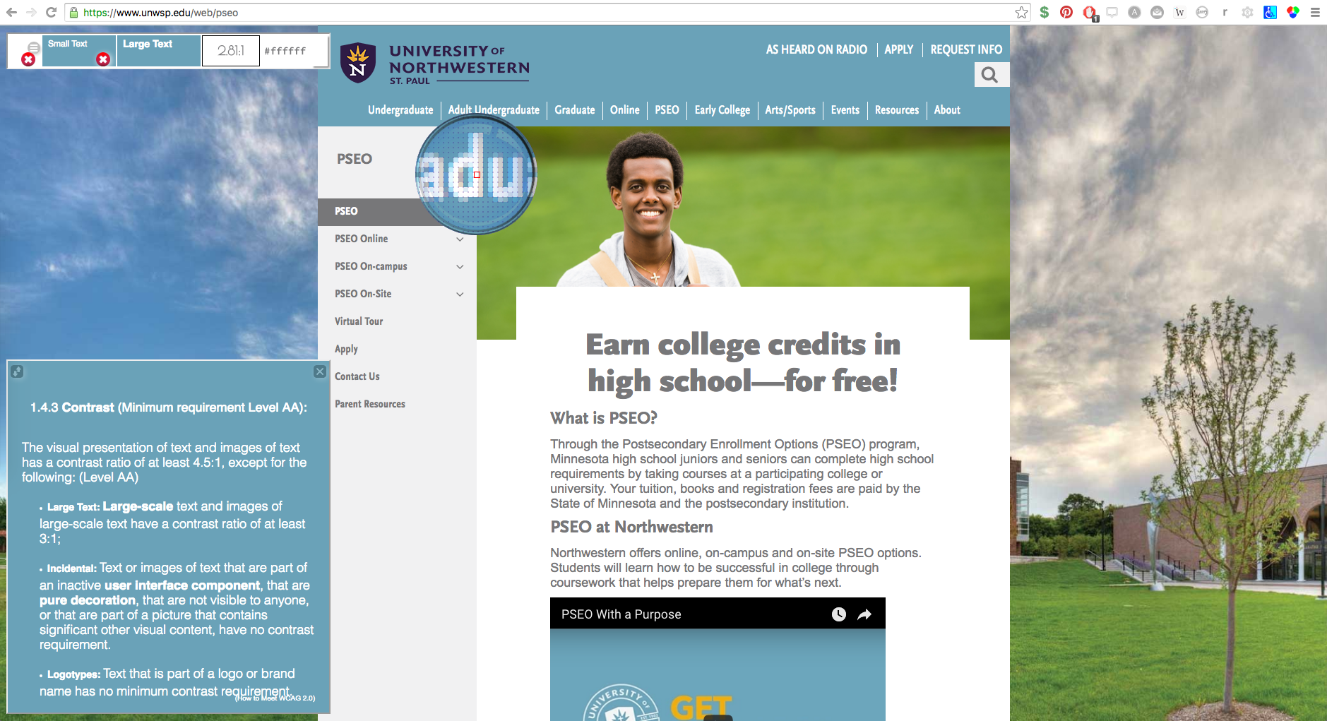
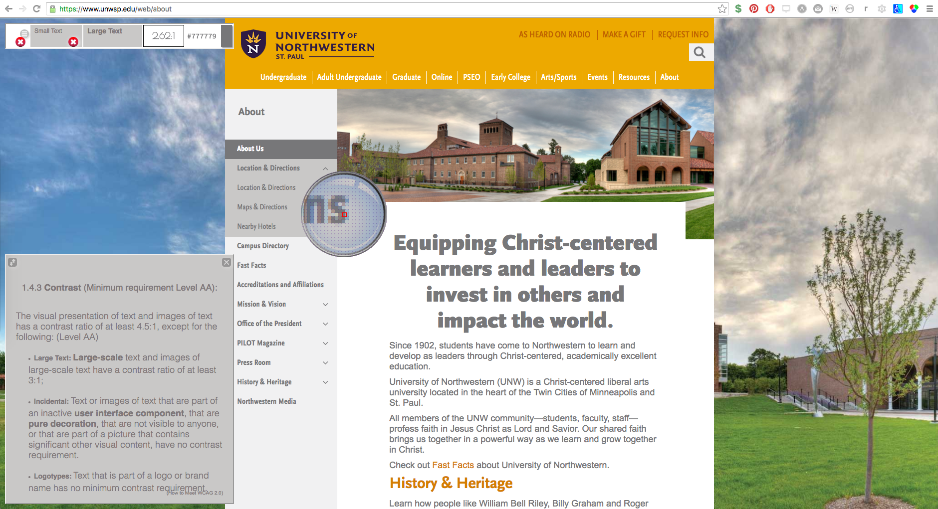
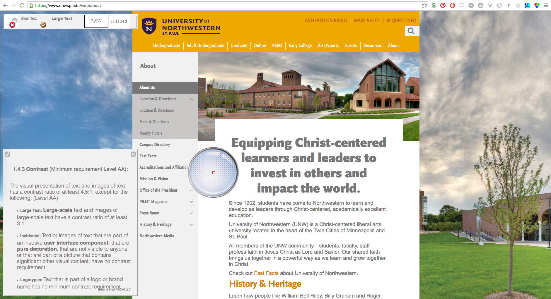
To start the UX redesign process I first had to identify what specific WCAG 2.0 section we needed to comply with for the visual navigation. After reviewing w3.org I determined that we needed to meet section "1.4.3 Contrast (Minimum) - Level AA" compliancy under section "WCAG 2.0 Section 1.4 - Distinguishable". This section states that:
1.4.3 Contrast (Minimum) - Level AA
The visual presentation of text and images of text has a contrast ratio of at least 4.5:1, except for the following:
- Large Text: Large-scale text and images of large-scale text have a contrast ratio of at least 3:1;
- Incidental: Text or images of text that are part of an inactive user interface component, that are pure decoration, that are not visible to anyone, or that are part of a picture that contains significant other visual content, have no contrast requirement.
- Logotypes: Text that is part of a logo or brand name has no minimum contrast requirement.
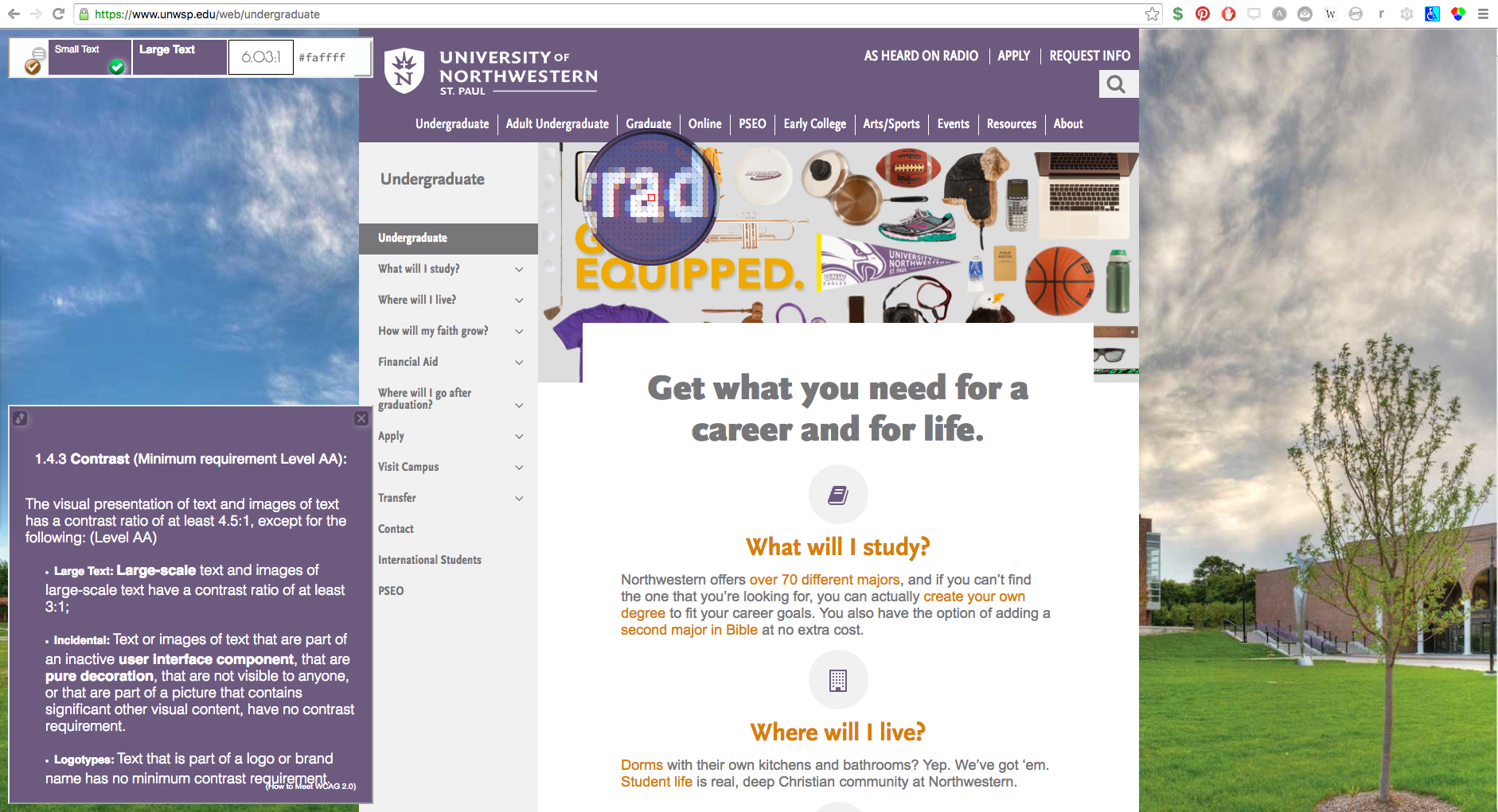
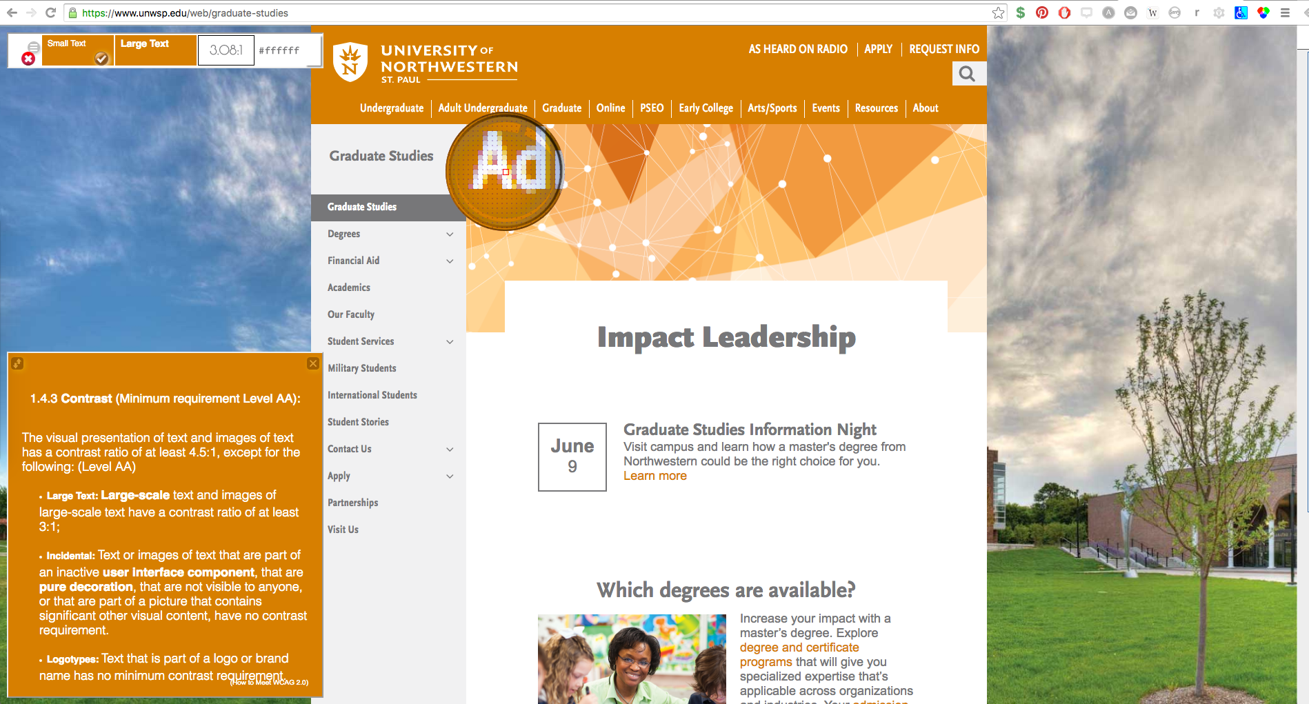
Using a variety of online contrast ratio analyzers I then went through the different color iterations of the website to analyze which sections of navigation text had enough contrast and which needed to be adjusted. For "Large Text" the ratio needed to be a minimum of 3:1. This audit identified that over half of the color contrast between the mega menu and the community navigation fell below that goal. Since the navigation colors were in relationship to our overall brand, our challenge would be to find a way to keep the same colors, but adjust the contrast enough to meet the 3:1 ratio.
Search terms (SEO)
For better SEO/SEM results we consulted with our Google Analyst to identify specific navigation terms and content potential students were looking for. This way we are being strategic about content to make sure it is in-line with users wants. These guidelines included:
- Listing the top 10 google searched programs for each educational venue.
- Using user terms such as "degree" instead of "major" or "areas of study". Or "dorms" instead of "student services"
This allowed us to develop a mega menu that is user centric instead of corporate centric. Which should result in higher rankings for search results as students are looking for a school that fit their needs.
Once these degrees and terms were identified I developed a site map to give an overview of all the new navigational links we were adding to the mega menu. Previously the mega menu had been a single level of navigation. By mapping out the second level this allowed our team to have discussions related to what links were listed and if there were any foreseen issues.
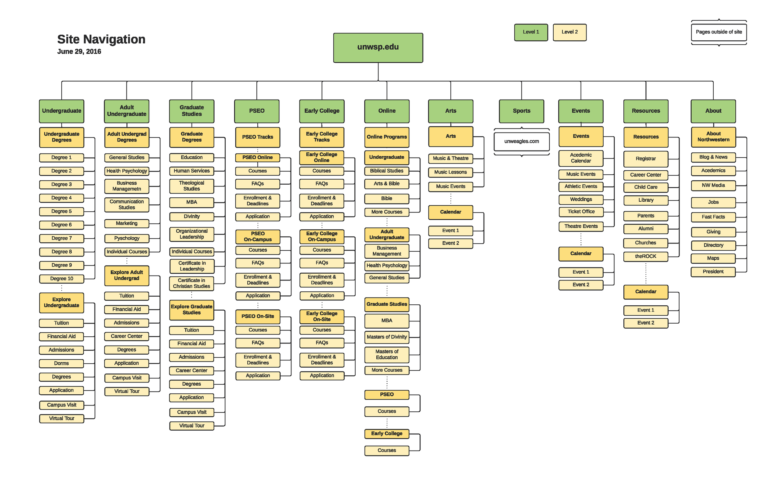
Once the site map was developed this allowed us to create wireframes of how the mega menu would look in desktop and mobile. It also allowed us to identify the need to divide our second tier of links into two categories: branding navigation and SEO navigation.


Combined solution
The final solution incorporated our need for higher contrast by using a uniform subtle text shadow along and increasing the font size to meet the 3:1 contrast ratio.


